Siglo.
Mobile Application / Publication / Capstone ProjectMy Role
Product DesignerSlide DesignerPresenterTeam
Nguyễn Hoàng Nhân (Me)Trần Ngọc Huyền DiệuTimeline
Mar 2025 — Sep 2025Organization
SU25 Capstone Project at FPT University HCMCAbout
One-for-all Community Messaging Application for Influencers, KOLs, KOCs, Creators.
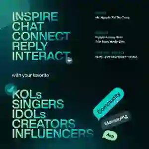
A broadcast-style messaging app where celebrities, influencers, who can take advantage of the app's features, connect, inspire, and build private communities with their fans or their target audiences. A next-generation messaging platform, trendsetters to connect, ignite conversations, and lead their audiences like never before.
Media > Dim white point preference or press on the media to go into its Lightbox mode with original colors.Where did the idea start?
01. We lack a dedicated platform for content creators.
In reality, there are plenty of social media platforms available for content creators, celebrities, KOLs, and KOCs to use. However, they are forced to "coexist" with ordinary users.
Don't get me wrong, we aren't trying to create an environment for an "elite class"; rather, the goal is to clearly distinguish between these two separate user groups, each with its own distinct responsibilities and purposes.
02. Need a platform that builds for and respects both groups.
A space free from the clutter of random, unrelated content. A place that opens up when a content creator wants to reach their fans, and when fans want to connect with the creator.
Policies and conditions that target the right audience, without being overly comprehensive and leading to conflicts in user management and protection.


03. Creators need more than followers.
In the age of the creator economy, influencers and KOLs struggle to build real, lasting communities on platforms dominated by algorithms and fleeting attention. Siglo is a new-generation messaging app designed to give creators full control over their audience, transforming followers into active community members through private channels, broadcast rooms, and exclusive content spaces.
04. Our app empowers communities to thrive.
With Siglo, creators can engage their fans directly, spark conversations, and nurture loyalty without intermediaries. By combining the intimacy of chat with the reach of broadcast, Siglo becomes not just a messaging tool, but a movement builder
- empowering creators to grow, lead, and monetize their own digital tribes.
The Problems.
01. Create an environment where individual Identity matters.
We don't actively seek out the majority of users. The majority user group (followers) will come when their favorite person is there.
Therefore, the goal is to attract this "core user" group (creators) and ensure they feel secure, allowing them to focus more on their own growth.
The Absolute Solution
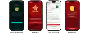
Integrate and require users to log in or authenticate via national-level identification methods, such as VNeID in Vietnam.
Typical examples in Vietnam are financial and banking applications.
Implement tiered verification levels, requiring higher-level identity authentication only for users who wish to engage more deeply or access interactive features.
Siglo Identity Level 1 (SIL-1)
The basic registration and verification process allows you to use the app with its basic functions, suitable for exploring the application.

Siglo Identity Level 2 (SIL-2)
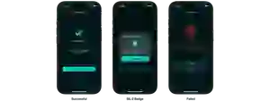
More identity verification steps are required, such as comparing facial recognition and national ID card data against the authentication platform's database. After successful verification, an authentication badge will appear next to the username as a symbol of trust.


02. The Influence of Influencers.
Regardless of who we are - rich or poor, laborer or high-status individual - we are all human beings entitled to human rights. The difference between an influential person and others is their ability to create influence, initiate, spread, advocate, attract, and inspire.
There are many ways to become famous, but given the current state of social media platforms, many people become famous by conveying harmful and shocking titles and contents, and naturally, this attracts a great deal of public attention.
We cannot simply blame those who passively consume this content where the distinction between good and bad matters less than the level of engagement it generates, as platform algorithms ensure that highly interactive posts reach a wider audience.
The Transparent Solution
Let users choose the content creators they truly want to follow.
Create an invisible pressure of identity where content creators are held accountable for their past, present, and future actions.
Followers should also face similar pressure, so they pay more attention to their words, interactions, respect for others, and accountability for themselves.
When each individual becomes aware of their true existence, rather than being just an anonymous person behind a screen, they naturally become more self-aware.
Initial Research & Surveys.
01. Survey.
We ran a small survey campaign at the start of the project. Over 120 people responded, and the results made the project very promising.
92% of respondents are or have used an application that has an integrated "Community Chat" feature.
The figures and applications confirm a very promising market.

Many difficulties that even those who are admin or managing community groups. Siglo's mission is to solve these problems.

Even regular users have difficulties in accessing, Siglo also needs to pay attention to ensure 2 separate user flows.
Not only is the percentage of people who have used it high, but the frequency of their use is also quite high.

02. Problem Statements.
We've identified three core issues currently facing us:
Creators lack a place that is truly born for them.
Organizations also need a more dedicated platform with tools to help reach more detail.
The community of fans need a platform that can motivate their idols to want to communicate.
Market Research.
01. Market Segmentation.
We've identified five market segments based on user type: individual users, small enterprises, large businesses, government agencies, and non-profit organizations.
And Siglo targets:
Individual Users
Content creators, KOLs, KOCs, influencers, teachers, artists, singers, etc.
Small Enterprises
Talent management companies, entertainment companies, music bands, etc.

Secondly, we've categorized the application platforms into three types: personal messaging platforms, social messaging platforms and business messaging platforms.
In this Category
We'll be competing with personal messaging platforms and business messaging platforms.

Finally, there are the core features, which statistically fall into 5 categories: SMS/MMS & RCS messaging, instant messaging, enterprise & team communication, social media messaging, and group & community messaging.
In this Segment
We'll be focusing on group and community messaging features.

02. Market Size.
According to statistics, the market size of messaging platforms in general will increase sharply from $47.6 billion to over $165 billion between 2024 and 2034, with a compound annual growth rate (CAGR) of 13.25%.

User Analytics.
01. Target Audiences.
We're Aiming
KOLs, KOCs, niche Content Creators (esp. lifestyle, food, travel, beauty), who can take advantage of the app's features, and their follower in communities.

03. User Personas.
Pain point: Casual followers drop off quickly, no space to take care of their most dedicated fans.
The Solution
A private platform, only for Creators and fans, not affected by unnecessary objective factors, transparent about the identity of those who can interact.

Pain point: Find a simple platform that meets the teaching needs. Free software is always better.
The Solution
A platform that integrates the features and tools needed or utilized for teaching, clearly dividing user sections.

Pain point: There is no platform that creates a sense of intimacy and privacy for idols to share comfortably.
The Solution
We need a platform dedicated to following idols, not just one but many idols at once. This is not a bad thing, but idols like that also want to receive a lot of followers.

Competitive Analysis.
01. Direct Competitors.
Feature to Talk
Instagram — Broadcast Channels.
Pros
Wide ecosystem, taken over by a long-standing company like Meta (formerly Facebook).
Has a huge number of users worldwide.
Where many content creators, artists, photographers use and are also welcomed by them.
Cons
Originally a social network with a simple messaging feature.
The conditions for creating a Broadcast Channel are quite high and complicated, usually for people with Social Status from Medium or higher.
Poor account identity verification, it seems that anyone can create as many accounts as they want.
Feature to Talk
Messenger — Community Chat.

Pros
Wide ecosystem, taken over by a long-standing company like Meta (formerly Facebook).
Has a huge number of users worldwide. Is an almost indispensable messaging application on everyone's phone.
Multiple features, built-in AI chat.
Cons
Overlap with Instagram platform in community chat feature.
Can't find someone by phone number, can only search by name, and there are a lot of duplicate names.
Personal, group, and community chats are all in one place, making it hard to distinguish.
02. Indirect Competitors.
Feature to Talk
Discord — Server / Community Server.

Pros
Attracted a huge number of users (mostly gamers initially).
Has a huge number of built-in features.
Has some really useful features like channel sharing within the server.
Has a highly customizable user interface, attracting more users because they can create an interface that they like.
Cons
Because of the many features enabled by default, the interface becomes confusing and makes new users hesitant to use it.
It works better on computers than phones.
Some features such as video stream resolution and refresh rate require a paid package to increase.
Feature to Talk
Zalo — Community Group.

Pros
Thorough user verification and limiting the number of devices logged in may be a plus in avoiding clone accounts.
There is a pretty good business subscription, trusted by state-owned enterprises and partner platforms.
More than 80% of Vietnamese people use it daily. Easy to use, even the elderly can also use it.
Cons
Lack of transparency in the use of user data.
Regularly losing photos and videos despite full backups, it is especially annoying when it happens in large groups like Community Groups.
The built-in social media platform is not great, due to bad UX and not being able to see other people's comments, although that's what a social network should have.
There are also a few other indirect competitors, though they aren't particularly well-known among Vietnamese people in general.

Build the Branding that makes sense.
01. Typography.
After researching and consulting major and modern messaging platforms, we concluded that sans-serif fonts are necessary. They are easy to read on small screens, compatible with digital displays, and above all, they are modern.
This decision is also supported by psychology and an analysis of typeface anatomy.
What We Chose
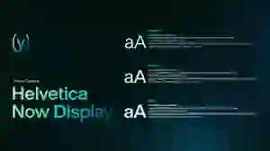
We decided to choose Helvetica Now Display, a very familiar typeface, a modern evolution of the classic single-master typeface Helvetica.
And another point that very few people notice, even big brands. With the same font weight, black/dark text on a white/light background will appear thinner than white/light text on a black/dark background.
Accessibility Solution
We increase 1 unit of font-weight in light mode. For example, Regular on dark mode become Medium on light mode, and so on.

02. Colors.
These are the logos of messaging apps that we found. As you can see, the blue color band is the longest, which is scientifically proven according to color psychology.
Blue is often associated with trust and calm, making users feel safe when exchanging personal or sensitive information.
It also represents communication and efficiency, which are key elements of any messaging app.
The reason of colors you're seeing
It's also easy to see that we chose all three of the most vibrant colors (kind of) in this color spectrum: yellow, green, and fluorescent blue.
03. Logomark.
A bold and recognizable logo is a prerequisite to become an identity image for both the application brand and the application icon.
In addition, because Siglo is a messaging application, the shape of the logo cannot lack the shape of a chat bubble so that users can easily build behavioral memory when using it.

The left one
It looks dynamic and more clearly depicts the S-shaped symbol in the brand name. However, it appears very messy and disorganized.
The right one, yes, the right one
It looks neater, more serious and professional, organized, simple, still showcasing the S-shaped design but without being too obvious.
This logomark clearly reflects the app's main function: messaging and community. Furthermore, it represents innovation, credibility in person-to-person communication, and much more.
04. Logotype.
The logotype has two distinctive features.

The square mark of the letter "o", both to emphasize the word "alo" and to have a curved shape representing Signal.
The letter "g" is stylized with a rounded shape, resembling the number 9. This is also the number of wings on the verification badge.
05. Primary Logo.
The complete version combines both the logomark and the logotype.
Grid systems, spacing and safe zone of the logo.

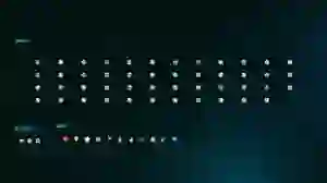
06. Application Icons.
Different versions on different devices and operating systems.


Application icon with dark version as main, there are also light and tinted versions.


Design System.
01. Spacing.
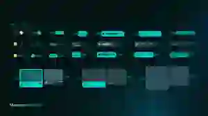
Some commonly used spacing sizes. The entire project uses multiples of 4 (not necessarily consecutive). Some exceptions include 0.5, 1, 1.5, and 2.

02. Layout Grid & Hierarchy.

As the application primarily targets mobile users, we studied the safe, less safe, and hard-to-reach zones when designing the interface for Siglo.
Designed for Thumbs
Move interface elements and buttons to the bottom edge of the screen, prioritizing the left side.
Since people typically use both hands when typing, having the send button on the right is not an issue.
Place buttons that require less frequent interaction along the top edge, leaving the central space for the main content.



















Sitemaps.


User Flows.





























Usability Testing.
01. Pre-Tesing.
We've tested 5 people on the user side between the ages of 16 and 41.
Testing Plan
Testing time per person: 40 to 60 minutes.
Implementation method: Live testing, online testing via Google Meet.
Supporting tool: Figma.
Testing goal: We focused on the usability of the main functions, finding problems, incomplete features as well as evaluating the interface of the application.
Functions to Check
Task 1: Sign up, Sign in & Authentication (SIL-1 & SIL-2).
Task 2: Go to the Discovery tab and join, send approval to channels.
Task 3: Send a message in the main chat box and react.
Task 4: View message thread, send reply, and reply to others’ replies, like others’ replies.
Task 5: Go LIVE and end LIVE.
Task 6: Join the creator’s LIVE.
Task 7: Create a post and interact with others’ posts in the Media tab.
Task 8: Recharge and withdraw money from SigPay.
02. Results.

The Result Showed That
Middle-aged or older people are not familiar with some strange or advanced features, which is understandable.
More research and testing are needed to improve.
Wireframes.

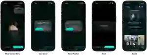
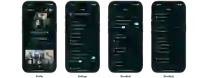
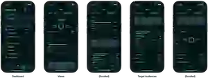
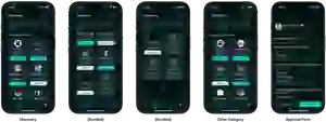
Final Product.
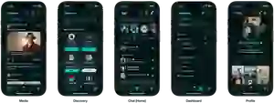
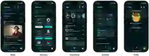
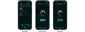
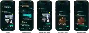
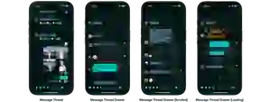
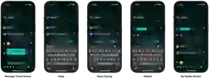
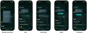
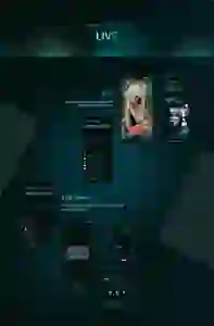
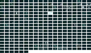
01. 550+ Designed Screens.
Over the course of more than 130 days, spanning ideation, research, defense and development, we successfully completed over 550 fully designed screens. This is an achievement we are truly proud of.
To put this in context, we produced three to four times as many screen designs as other teams did within the same timeframe.

Recommendation
View all final designed screens on
Behance
.


Recommendation
View all final designed screens on
Behance
.
Prototypes.
As previously mentioned, Siglo features two distinct user flows: Creators and Normal Users. We have recorded demo videos of the Figma prototype for both flows, totaling nearly 10 minutes in length.
The Purpose
Demonstrating the interactions, interface, and usage of the application for both user groups.
Note
The voiceover in the videos is in Vietnamese only.
Design Applications.
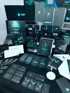
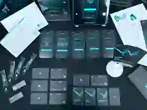
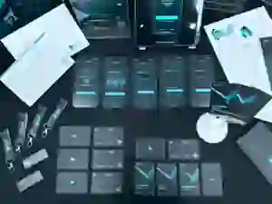
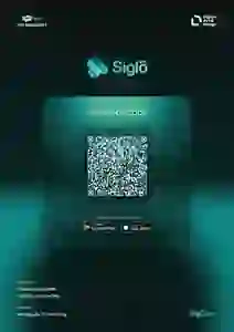
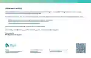
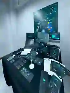
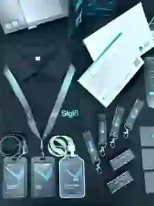
01. Printed Matters.
Over the course of more than 130 days, spanning ideation, research, defense and development, we successfully completed over 550 fully designed screens. This is an achievement we are truly proud of.
To put this in context, we produced three to four times as many screen designs as other teams did within the same timeframe.



















Presentation Decks.



Challenges & Limitations.
01. Figma is not that good at prototyping.
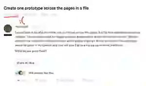
While Figma allows us to divide files into multiple pages, it does not support linking prototypes across different pages. As a result, we had to place all 550+ screens on a single, massive canvas to create a complete user flow. This made the file extremely heavy and the prototype connections look like a giant spider web.
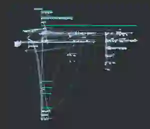
Someone raised this issue five years ago - according to a post on the Figma Forum.
Exploring Advanced Alternatives
For future massive projects, I realized relying solely on Figma's native prototyping is not optimal. I am planning to explore professional interactive tools like ProtoPie.
Tools like this allow designers to manage screens by "Scenes" and build logic-based interactions without canvas clutter. Best of all, they offer a seamless handoff via Figma plugins (importing designs directly without losing layers). Mastering these advanced solutions will definitely be my next step to optimize the prototyping workflow.
02. The 4-month deadline & ruthless prioritization.
We faced an extremely tight timeline of just over 4 months to complete everything, from the initial ideation to the final presentation day.

Because we invested so much time into perfecting the app's UI/UX, other areas like the landing page, marketing materials, and product launch TVC lacked the final polish. We even had to outsource the TVC production to meet the deadline.
We even planned to create a desktop version (PWA) of the application, but in the end, we had to abandon that part due to insufficient time for implementation.

The Lesson on Prioritization
This time constraint taught me a hard lesson in product management: prioritization. Instead of trying to design every single possible screen, I learned that I must focus on the absolute essential flows first (the MVP approach). Balancing the core UI design with other equally important business and marketing assets is the key to a truly successful product launch.
Reflections & Takeaways.
01. Managing a massive scale of 550+ screens.
Designing over 550 screens was a magnificent task. The biggest lesson I learned was that a robust Design System is not just a luxury, it is a survival tool. Without defining the spacing guidelines, typography hierarchy, and master components early on, maintaining visual consistency across hundreds of states would have been impossible.
It taught me to think in systems, not just individual screens.

02. Handling feedback from the council.
Defending the project across 4 milestone presentations (0%, 30%, 70%, 100%) acted as real-world stakeholder reviews.
There were times when the council pointed out flaws in the user flow, or identity verification processes (SIL-1 & SIL-2) were not needed and time consuming.
The Siglo project started in Q1 2025, and as of Q3 2026, Vietnam is gradually pushing and requiring social media platforms to verify user identities to minimize online fraud.
I needed to filter the feedback, deciding which to adopt and which to challenge. I chose to retain the identity verification processes - a feature that makes Siglo unique.
I learned not to be emotionally attached to my initial designs.
Accepting feedback, pivoting quickly, and defending UX decisions with
data and psychology was the most valuable soft skill I gained.
03. Bridging Digital and Physical.
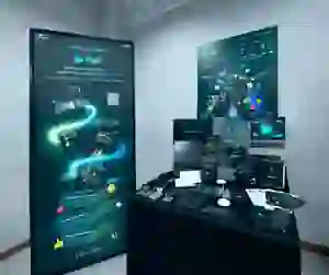
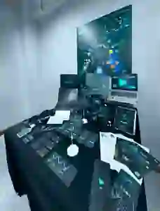
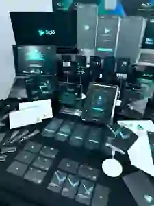
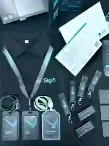
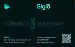
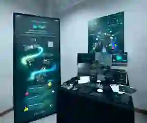
Translating Siglo's identity from a digital app to printed matters and booth displays came with unexpected challenges (like CMYK color shifting and readability from a distance).
It forced me to realize that a brand identity is only successful if it works everywhere, whether on a 6-inch mobile screen or a 1.8-meter tall physical standee.